Navigation Redesign
PROJECT OVERVIEW
The objective for redesigning the navigation on both the iPhone and iPad was to increase efficiency for the users as well as to confirm it to iOS 10 guidelines.
Role
Product Designer
Year
2016
Ideation
The sprint began by researching and gathering information on the current navigation while taking into consideration Apple’s user interface guidelines. Working with my product owner, we were able to determine what were the most important features people wanted to see in a tabbed navigation.

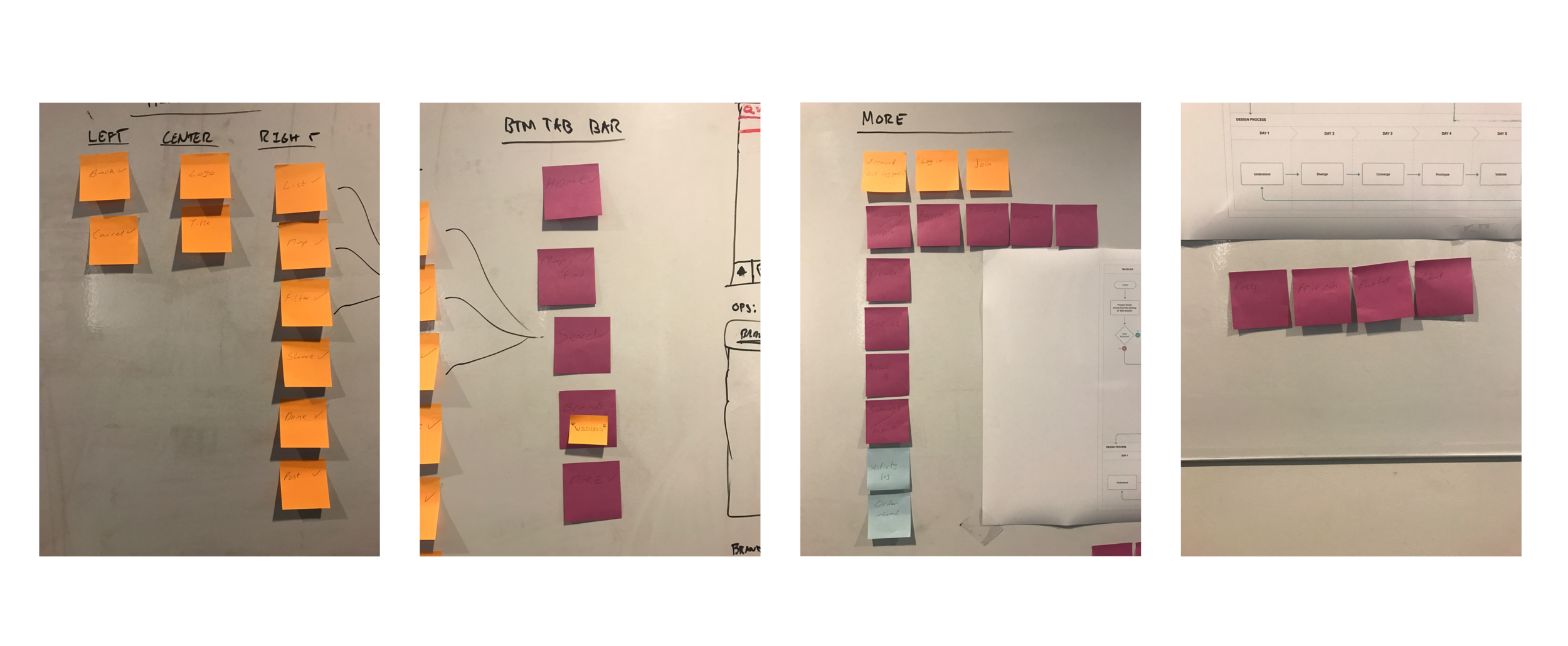
Brainstorming
Working along side my design manager and product owner, I proceeded in making several sketches on the whiteboard through a process of crazy 8’s. The goal was to figure out how the user experience would be once the tabbed navigation is implemented, in the hopes that the change would not disrupt the current user engagement with the app.
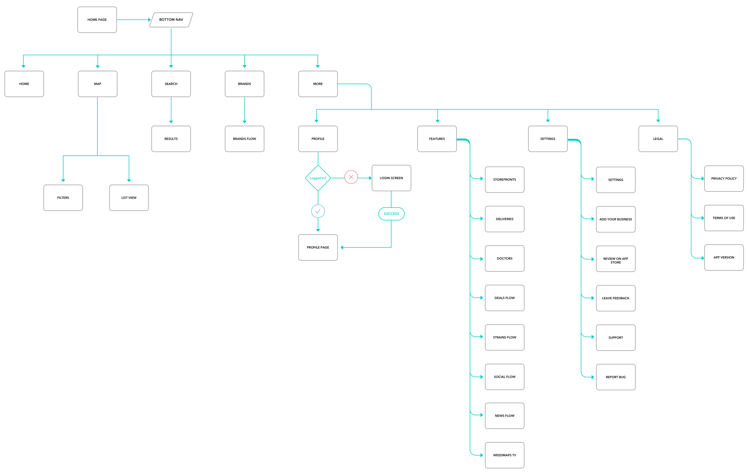
User flow
I designed a flow to understand the structure of the existing app. It helped me get a clear idea on how to create the functionality of the navigation. We identified several instances whereby the user might get lost an example being the more tab since the bar was limited to just our top 4 prominent features. It was decided to place the other features on the more tab and with a new onboarding animation indicating that its importance.
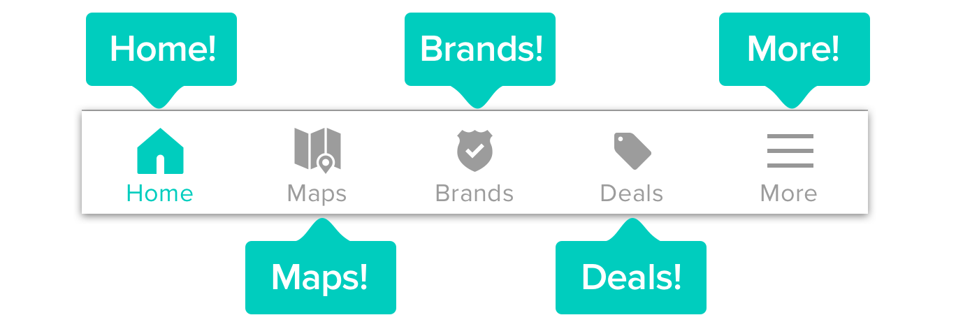
Tabbed Navigation
I focused on determining an efficient way to navigate across the app while keeping the existing brand style. Then we came up with several Icons that could best represent the features in the app. Once the icon where selected, a few interactions were made to have an idea of what the animation looked like when a user navigates between each tab.

UI DESIGN
After several rounds of critiques and clean-up sessions, High fidelity prototypes were made. We came up with a series of tests for the users and received internal feedback on the functionality of the designs. Then my project owner and along with the developers identified any tech dependencies overlooked before final implementation. Finally, after getting the thumbs up on the project, I passed the final designs to the developers.


Success Metrics
○ User on-boarding flow design improved by 15%.
○ User engagement: average visit per user increased to 30% and daily downloads by 187%
○ Grew iOS Daily Active Users by 137%.
○ The deals tab drove traffic to the app as users had initially wanted quick access to the feature.